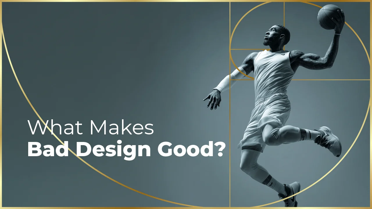
When you look at a design and say "something is wrong but I can't quite figure out what," the problem is not color, not typography, most likely not the visual choice either — the problem is composition. It is easy to describe what looks right or wrong in a design; but explaining why it feels that way is an entirely different matter. Composition rules are the guide to that very question of "why." These principles — stretching from the rule of thirds to the golden ratio, from symmetric balance to asymmetric dynamism — often work unnoticed beneath your visual decisions, either stopping your frame exactly where it needs to be or leaving the viewer lost. In this article, I am not skipping over any rule by saying "everyone already knows this"; I will try to explain each one from scratch, but through the eyes of a practitioner.
Composition Rules: What Makes a Frame "Feel Right"?
What makes a design feel "right" at first glance? Most of the time we cannot describe it, but we feel it. That feeling is the work of composition.
Composition defines how the elements within an image — typography, photography, graphic elements, space — are positioned in relation to one another. What makes a frame beautiful is not color, not proportion, not any single element on its own, but the relationship those elements form with one another. Composition governs that relationship.
To manage these relationships, a series of techniques emerged over the centuries — tested, proven, and recognized as universally valid. We call these "composition rules." But we must be careful: these are not rules, they are tools. When we say rule, what we mean is not that you are obliged to follow them, but that by understanding them you can make your choices consciously.
Photographers use these tools at the moment of framing, designers in layout decisions, directors in scene construction — all of us are actually using these tools. Sometimes knowingly, sometimes intuitively. The goal is to elevate these tools from instinct to the level of consciousness. Because a consciously used tool retains its power both when it works and when it is deliberately broken.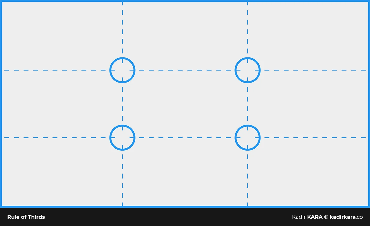
The Rule of Thirds: Why the Center Is Always the Wrong Place
The rule of thirds is the most well-known and most widely used composition technique in the worlds of design and photography. It begins with a simple premise: when you draw two lines dividing the image area into thirds both horizontally and vertically, the four points where these lines intersect are the points where the human eye naturally directs its attention.
These intersection points are called "power points" or "focal points." Placing the subject not at the dead center but at one of these points provides both dynamic tension and visual balance.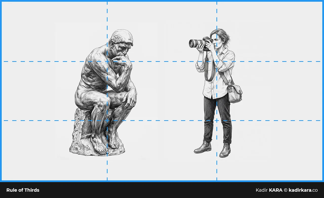
Why does it work?
Because the dead center imprisons the eye. A subject placed at the center gives a static and expected feeling. But when moved to a power point, the remaining space gains meaning. That space can be a place to breathe, context, a sense of time, or movement.
In photography, you can most easily see this rule in the horizon line. Placing the horizon line at the exact center divides the frame into two equal parts, emphasizing neither the sky nor the ground. But when you move the horizon line down to the lower third, the sky dominates, giving a wide and dramatic feeling. Moving it up to the upper line brings the ground to the foreground, and space and texture gain importance.
In graphic design, the same principle establishes the relationship between typography and visuals. When the main headline is placed at the lower-left power point and the visual element at the upper-right area, the eye flows along a diagonal path — this flow is both dynamic and creates a hierarchy.
You do not need to be under pressure to apply the rule of thirds. Most cameras and phones project the rule-of-thirds grid on screen in shooting mode. In design software, you can also set up guide lines this way. But over time you internalize this grid; you no longer need to add it, the mind delivers these lines without needing a program.
One final note: the best way to understand the rule of thirds is to break it. When you deliberately choose the dead center and can feel and control the tension it creates, you have truly understood the rule.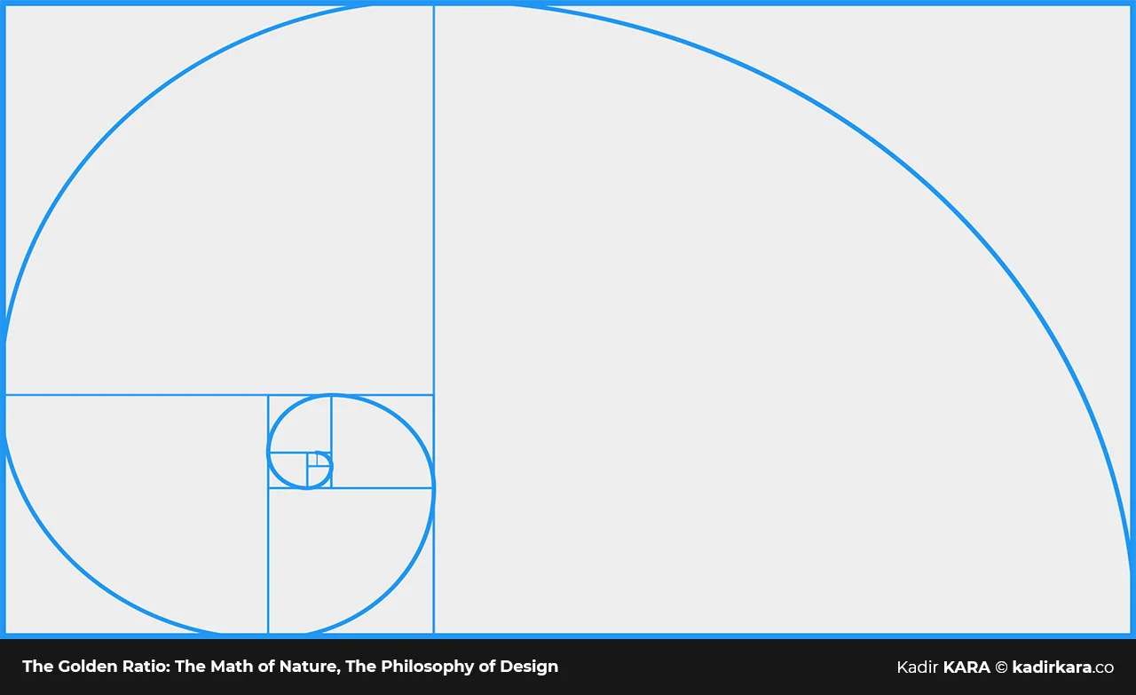
The Golden Ratio: The Mathematics of Nature, the Philosophy of Design
The golden ratio is a mathematical relationship expressed as approximately 1 : 1.618. The symbol phi (φ) was proposed in 1909 by American mathematician Mark Barr, in honor of the sculptor Phidias. It appears in nature in the spiral structure of seashells, in the arrangement of flower seeds, and in the proportions of the human body. Artists and architects have consciously used this ratio for centuries, because a form containing that ratio looks natural and balanced to the human eye.
In terms of design and visual composition, the golden ratio appears in two forms: the "golden rectangle" and the "golden spiral."
The golden rectangle is a rectangle with a 1:1.618 ratio. When a square is cut from within this rectangle, the remaining piece is again a golden rectangle with the same ratio. This process can be repeated infinitely. When you connect the corners of each square formed at every step with an arc, the spiral you obtain is the "golden spiral" found in nature.
What is the difference between the golden ratio rule and the rule of thirds?
The rule of thirds divides the image into three equal parts. The golden ratio, however, divides it into two unequal but proportional parts, and this asymmetry creates a more organic, richer tension. I do not think I would be wrong in saying that the rule of thirds is a tool, while the golden ratio is a philosophy.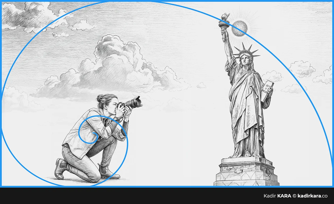
Practical Application:
It is not possible — nor necessary — to apply the golden ratio to every design with full mathematical precision. But once you internalize the fundamental logic, you begin to use this ratio intuitively in area divisions, typographic hierarchy, and the relationship between visual weights.
Placing a subject to the left in a relatively small area while leaving a larger negative area on the right is an intuitive application of the golden ratio. Positioning a headline in 1/3 and body text in 2/3 on a page also approaches this principle. Not an exact calculation, but the right feeling.
When applying the golden ratio, it is important not to go overboard. When you apply φ to every element, the system locks up and the organic feel disappears. The golden ratio is a framework, a guide. Managing the entire design with that calculation, however, mechanizes it.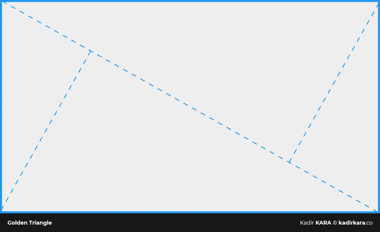
Golden Triangle Composition: The Hidden Skeleton of Dynamic Frames
The golden triangle is a powerful tool especially for dynamic, diagonal-heavy compositions. The core idea is this: the image area is divided into three triangles by a diagonal line drawn from corner to corner and two lines drawn perpendicular to that diagonal.
This triangular division creates a natural sense of movement within the image. A flow is formed in which the eye moves from one triangle to another, pauses, and moves again.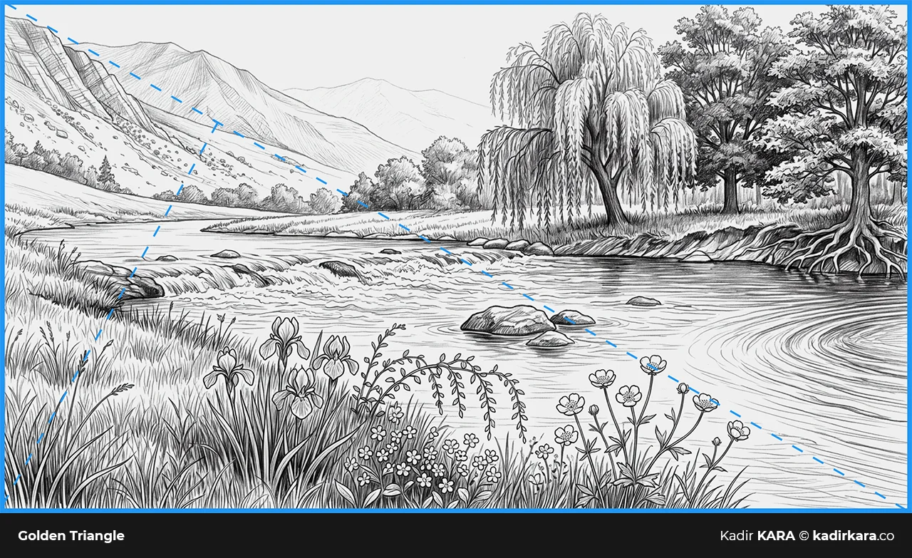
Where does the golden triangle work?
In compositions with oblique lines, diagonal elements, or a strong sense of direction. In architectural photographs you can use the golden triangle to organize the line of an extending staircase, in landscape photographs a receding road, or in portraits the relationship between the shoulder and the direction of the gaze.
In graphic design, this technique provides a foundation for diagonal layouts, diagonal typography, or image areas with diagonal movement. The answer to "why is this text block at this angle?" is sometimes the golden triangle.
Compared to the rule of thirds, the golden triangle is a less systematic and more intuitive tool. It is sufficient to mentally place the three triangles on the image to apply it; it does not require a precise ruler.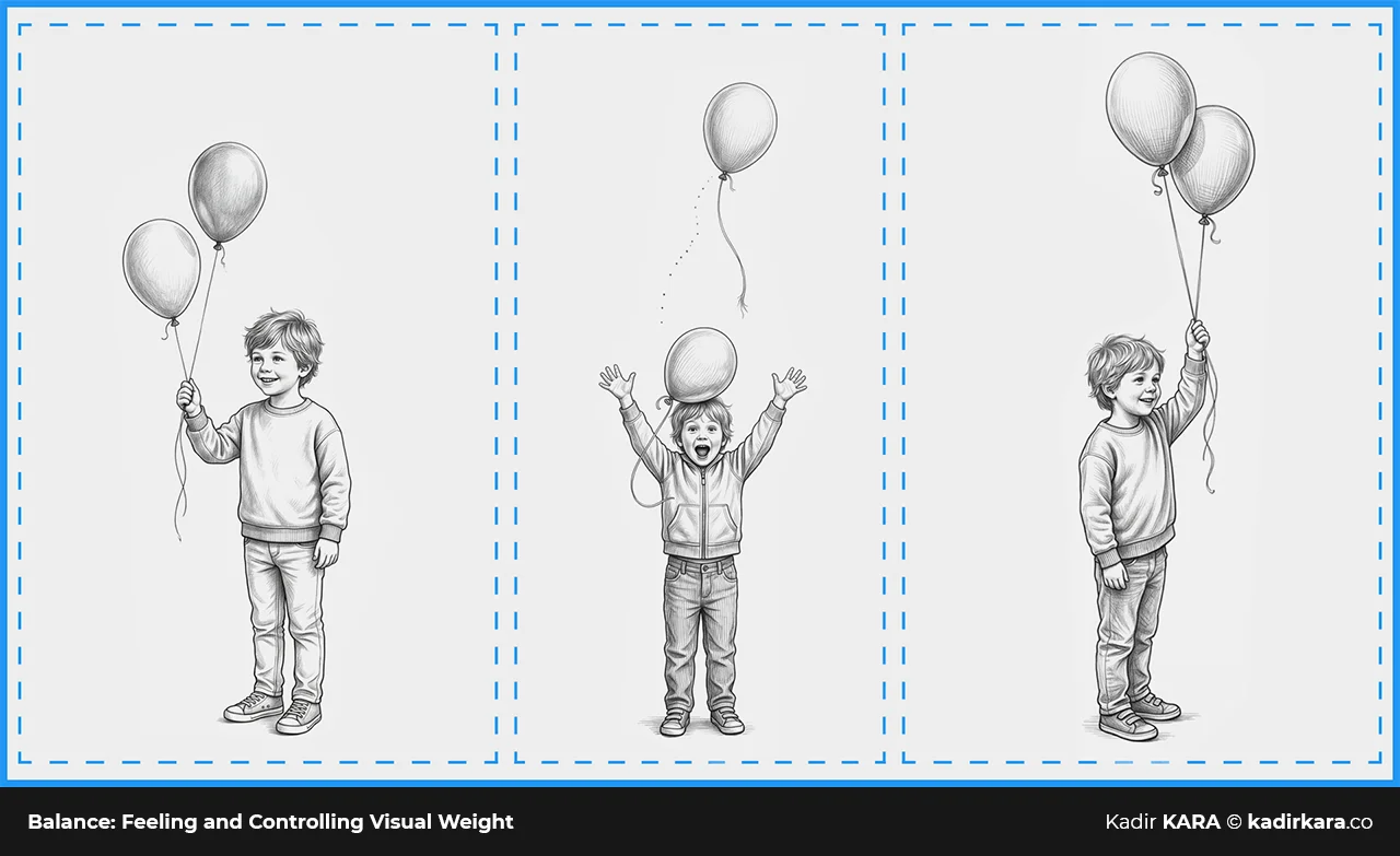
Balance: Feeling and Controlling Visual Weight
Balance is perhaps the most abstract yet most critical concept in composition. In an image, balance describes that state where all visual weights hold each other in mutual equilibrium — where no one says "the left side is too heavy" or "the right side is completely empty."
Balance is established in two forms:
Symmetric Balance:
The two halves of the image are mirror images or close equivalents of each other. This type of balance conveys a sense of formality, authority, stillness, and classical aesthetics. Architectural photographs, corporate identity designs, and luxury product compositions often favor symmetric balance.
Asymmetric Balance:
Elements of different sizes, weights, or densities are positioned in a way that balances one another but is not identical. For example: a small but dark object can be balanced by a large but pale one. Or a dense block of typography on the left is balanced by a single and powerful visual on the right. Asymmetric balance conveys a sense of dynamism, modernity, and tension.
What are the factors that determine visual weight?
Size, color value (dark is heavier than light), texture, contrast, and position. An element close to the edge of the frame sits lighter than one close to the center. An isolated element is visually heavier than an element in a crowded area.
Violating the balance rule can be a deliberate aesthetic choice, but in that case the discomfort created in the viewer's mind must carry a message. The difference between "this looks unbalanced" and "this is intentionally unbalanced" is control.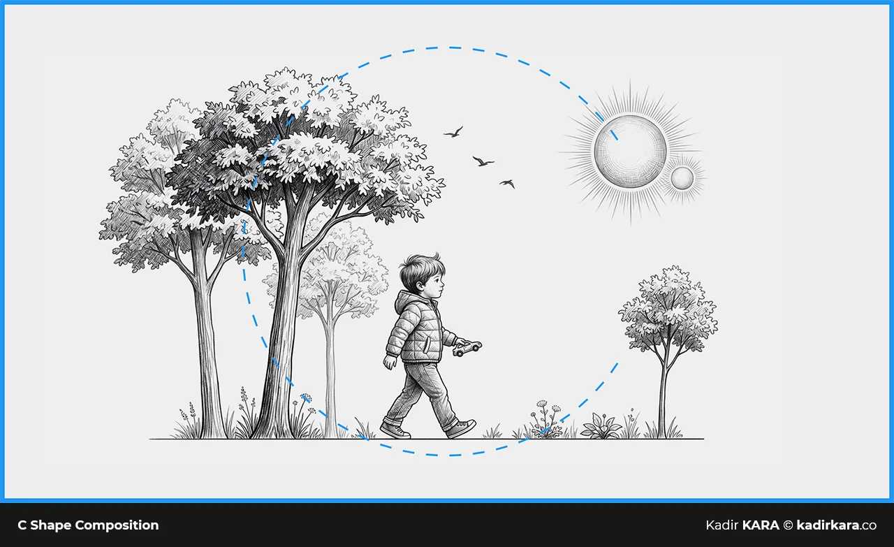
C-Shape Composition: The Arc That Keeps the Eye Inside
C-shape composition is a technique in which the elements within an image are arranged to form the letter C. This C determines the visual flow. The eye flows along the frame from the beginning of the letter to its end and ultimately arrives at the focal point.
This technique is particularly effective in photography, publication design, and product placement. The inner section of the C — the concave part of the letter — is where the main subject sits. The rest of the frame forms an arc guiding toward that subject.
Why is C composition powerful?
Because it provides a flow without creating a closed loop. The eye is kept inside but not imprisoned; it roams within the frame. This feeling works perfectly in soft, organic, and narrative compositions.
Practical Example: A landscape photograph taken along the curved line of a coastline or a river can naturally form a C composition. In publication design, a visual flow that starts at the upper-left corner of the page, extends along its lower portion, and curves up to the upper right mimics the C.
In digital design, C composition is frequently used in landing page designs. Distributing the visual or decorative elements to the top, right, and bottom of the screen while leaving the middle open for content is a typical application of this technique.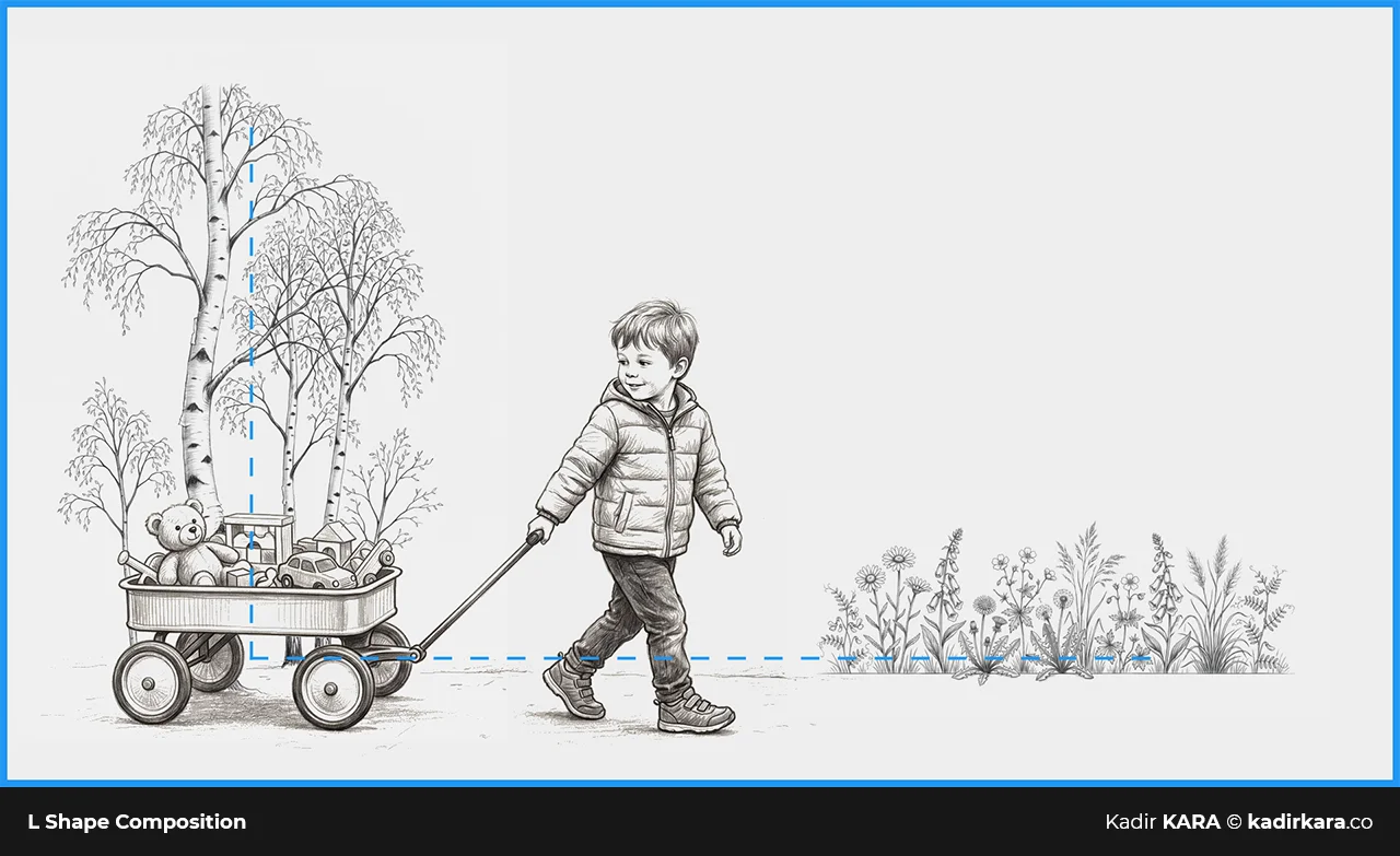
L-Shape Composition: Leaning the Weight into the Corner
L-shape composition is an arrangement in which heavy or dense elements are positioned along the bottom edge and left (or right) edge of the image, while the remaining area is left lighter or as negative space.
This technique gives a strong sense of ground and column. The two arms of the L function as a stabilizing anchor point for the frame; the remaining open area allows breathing room.
In architecture, photographs of tall buildings or corner structures frequently form an L composition. A close-up of a tree trunk and ground arrangement creates the same structure. In graphic design, a dark-colored or dense border element forms the frame at the bottom and left, while the inner area is kept open and airy.
The strength of L composition lies in the weight landing in a regular and predictable place. This predictability provides a sense of stability. In professional presentations, corporate publication designs, and visual communications where seriousness is in the foreground, this characteristic of the L proves useful.
The point to watch: when the two arms of the L are too dominant, too dense, or too dark, the open inner area can feel cornerless and alone. Balance is achieved by keeping the intensity of the weight under control.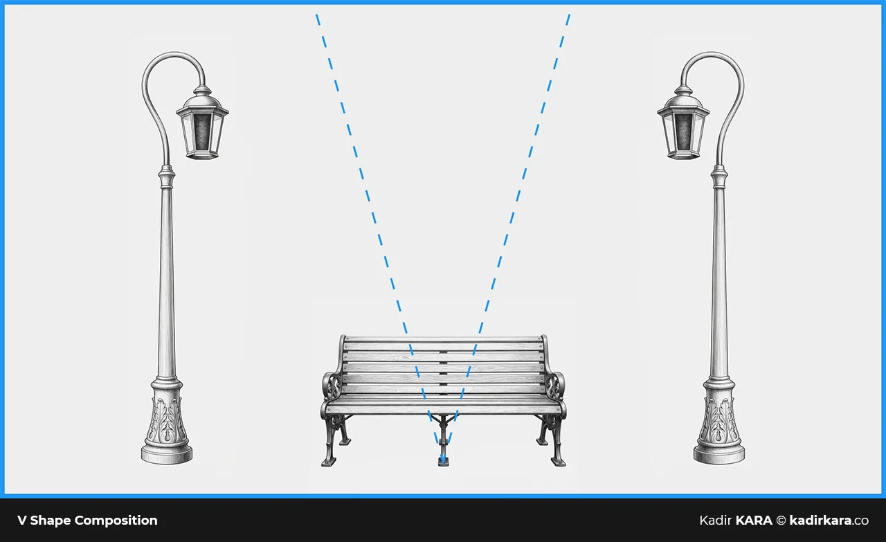
V-Shape Composition: Geometry Flowing Toward the Focus
V-shape composition is an arrangement in which elements or lines converge and flow toward the lower center, or conversely, spread upward and outward from the lower center. The inverted V — the Λ (lambda, the 11th letter of the Greek alphabet) shape — is also considered within this category.
The fundamental function of this technique is to establish powerful guidance and hierarchy for the eye. The narrow end of the V is a focal point; the eye is drawn there. Where the V opens out gives a feeling of expansion, freedom, or enrichment.
A mountain silhouette, roads stretching on both sides, or a corridor narrowing in perspective — these are all natural examples of V composition. This technique works effectively in architectural content, product launch visuals, and any composition in which a sense of depth is to be emphasized.
In product photography, the V highlights the product by positioning it in the upper section — the open area of the V — and fills the surrounding space with supportive elements. In advertisements, the product or message between two opposing poles is placed at the focal point of the V.
In graphic design, intentionally forming a V shape is sometimes achieved not through direct geometric reference but by controlling visual weights and directions. Dark or dense elements on both sides, tapering toward the center, create a powerful focal point.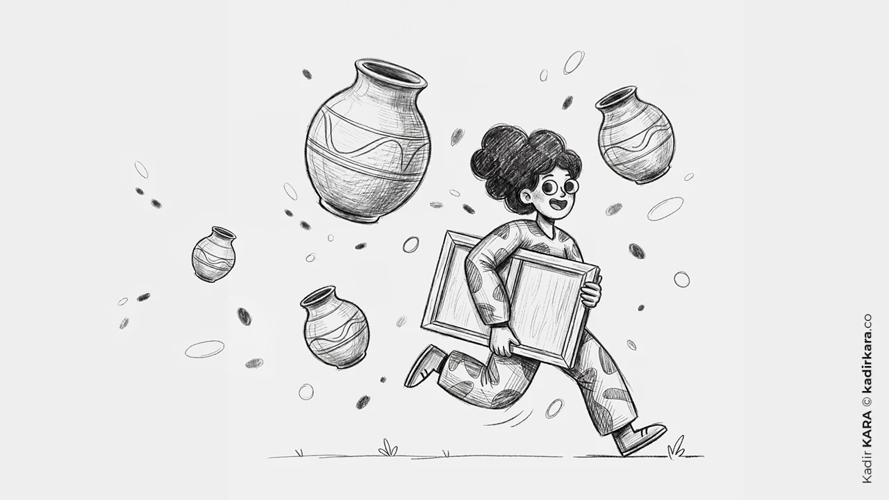
The Rule of Odds: Why Three Is Always Better Than Two
The rule of odds — sometimes referred to in Turkish as the "odd number rule" — arises from a simple observation: groups of elements in odd numbers appear more natural, more dynamic, and more harmonious than those in even numbers.
Why?
Even numbers create a tendency toward symmetry and pairing. When two objects are placed side by side, the eye seeks the axis between them and tries to establish a symmetrical relationship. Three objects, however, break this reflex; instead of grasping all three at once, the eye begins to explore the relationships between them. This process of discovery creates attention and interest.
Three flowers, five objects, seven independent visual elements — these form a richer composition than arrangements of two or four. You can observe this most clearly in photography and product placement. When a product arrangement on a shelf is in pairs, the eye passes quickly; when it is in threes or fives, it stops and tries to resolve the hierarchy among the groupings.
This rule also applies in interior design and scene construction. When directors place three characters in a frame instead of two, they create a dynamic and unresolved tension; this tension keeps the viewer inside.
Is it possible to overdo the rule of odds?
Yes. If you start placing every element under the compulsion of odd numbers, a forced and artificial arrangement emerges. This rule is a guide, not an imposition.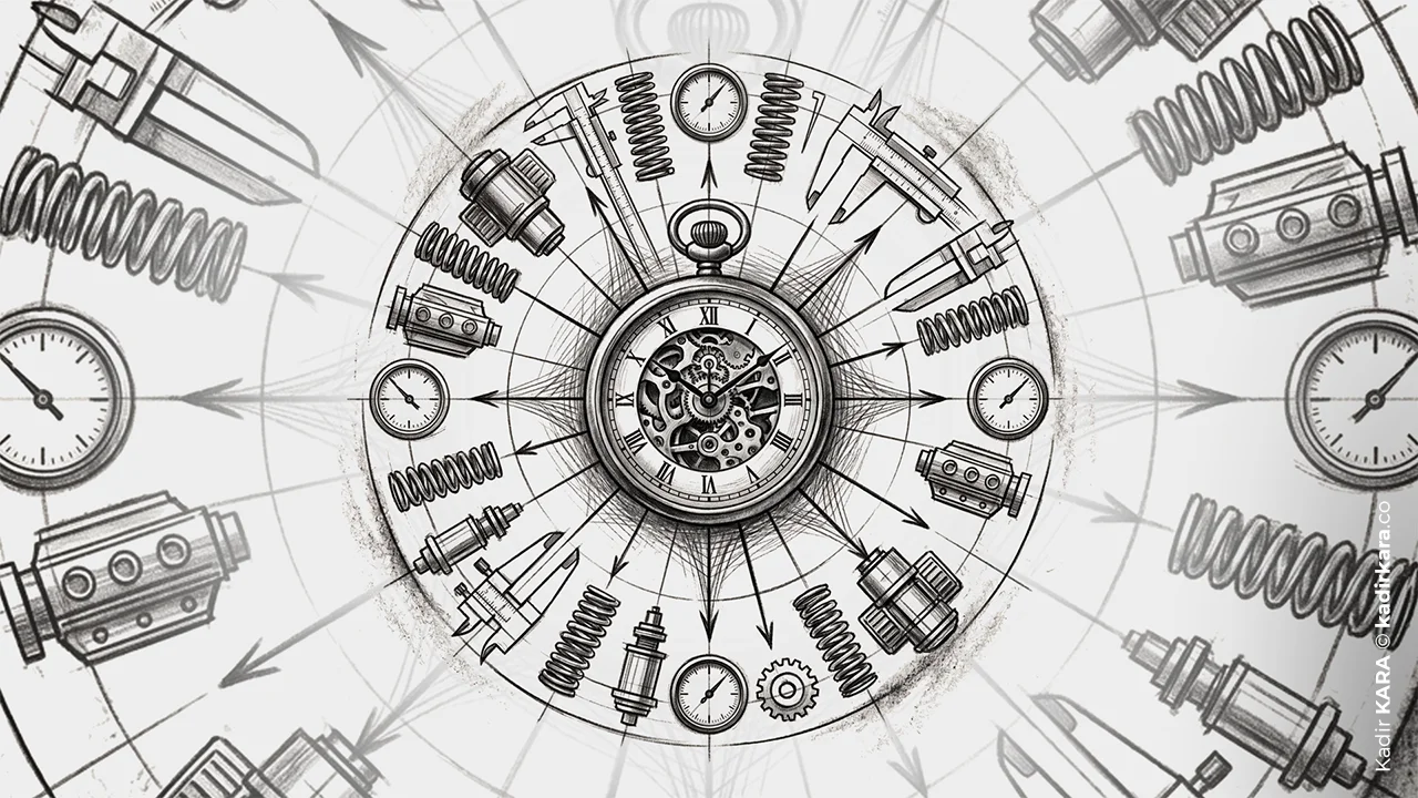
Leading Lines: The Eye Follows, the Brain Flows
Leading lines are based on the principle of natural or intentional lines within an image guiding eye movement. These lines begin at one point in the frame, take the eye on a journey, and carry it to the focal point of the composition.
These lines do not have to be actual lines. The edges of a road, the facades of buildings, the alignment of trees, the direction of gazes, a turned arm — all of these can form a visual line. What matters is that the eye follows these elements along a path.
Leading lines work in four forms:
Diagonal Lines
The most dynamic. They symbolize movement, speed, and tension. When a camera angle emphasizes the diagonal in a staircase scene, the viewer feels this tension.
Horizontal Lines
They give a sense of calm, stability, and continuity. The horizon line is the purest example of this.
Vertical Lines
They convey power, authority, and ascent. The lines of tall buildings and trunks in forest photographs create this effect.
Curved Lines
They give an organic, fluid, and intuitive feeling. Riverbeds, roads, the lines of the human body are leading lines of this kind.
In graphic design, leading lines are most often constructed. A typographic line, a color gradient, or a flow of white space is used to carry the reader's eye from the headline to the visual, and from the visual to the call to action. A well-constructed interface design guides the user's eye as to "where you should look." It does this not with words, but with lines.
The biggest trap of leading lines is making them too obvious. The more explicit and forceful the line, the more directed it feels — and the user senses this and resists. A good leading line carries the eye to the target content without making its presence noticed. A poor leading line lets the viewer sense that they are being dragged.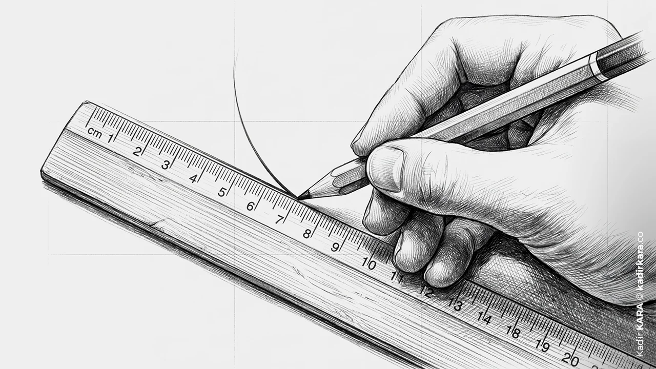
Knowing the Rules vs. Feeling Them?
I want to be clear here — these rules are not rules, they are guidelines. As Smashing Magazine emphasizes: "These are not rigid rules, they are guidelines. You don't have to apply any of them, but understand them and when you break them, know why."
The hardest thing I learned in 18 years of experience was this: breaking the rules without knowing them is amateurism; breaking the rules while knowing them is mastery. A photograph frame that skips the rule of thirds is powerful if it does so intentionally; it is weak if it does so without knowing why it is skipping it.
Practical suggestion: First design a composition by consciously applying the rules. Then break one rule from within the completed design. See what changes. This exercise teaches better than any sentence ever written to explain why the rules exist.
A SHORT NOTE
While writing this article, I paused the longest at the golden ratio section. In the design community, this ratio is either mystified — as if it were a magic formula that solves everything — or glossed over with "everyone already knows this." I agree with neither the mystification nor the dismissal. φ = 1.618 is a real mathematical ratio; the accuracy of some claims popular culture has loaded onto it is debatable; but its use as a tool for design evaluation and diagnosis is powerful. I have seen this in practice many times: there have been many instances where, while conducting a golden ratio analysis to understand why a composition that was not sitting right was not working, I found the answer in a ratio imbalance.
There is a reason I have taken up the subject of composition for kadirkara.co: I speak with graphic designers, art directors, and photographers a great deal, and most of these rules are theoretically "known" but not applied in practice. This article was written to close that gap. If you are leaving this page with only one thing, let it be this: you do not need rules to construct a balanced and engaging composition; but to know when you are bending which rule, you need to have internalized these rules.
DID YOU KNOW? - 7 QUESTIONS 7 ANSWERS
1. When and where did the rule of thirds originate?
Long before photography. In 1797, English painter John Thomas Smith defined this principle in writing for the first time in landscape painting in his book "Remarks on Rural Scenery." So this rule was a compositional principle used by painters for scene arrangement approximately half a century before the camera was invented. Photography inherited it and redefined it in its own language.
2. Is a symmetrical design always balanced?
No. Symmetry and balance are different concepts. A symmetrical arrangement can still be unbalanced in terms of color value, texture density, or typographic weight. When the left half is dark and the right half is pale, there is geometric symmetry but no visual balance. Balance defines not equality, but mutual equilibrium.
3. Are there designers who apply composition rules intuitively and correctly without ever having learned them?
Yes, there are. Someone who has been immersed in visual material for a long time — a photographer, an illustrator, even a good film viewer — can internalize these rules unconsciously. But the difference between intuition and rule is this: intuition leads you to what is right, while a rule tells you why you did something wrong. And you can only deliberately break a rule once you can name it.
4. Why does the "optical center" not coincide with the geometric center?
The geometric center of a rectangle is mathematically the midpoint. But the human eye does not perceive the whole with equal weight; it perceives the upper section as lighter and the lower section as heavier. This is why a logo or text block, when geometrically centered, can feel "low" visually. Optical centering requires placing the element slightly above the geometric center to compensate for this perceptual difference.
5. Is asymmetric balance really harder to achieve than symmetric balance?
Yes. In symmetric balance the formula is simple: place the mirror image of an element on the other side. In asymmetric balance, however, you need to manage many variables affecting visual weight — size, color, contrast, texture, isolation, position — all at once. Thinking of it as a seesaw analogy: in asymmetric balance you need to calculate the position of the fulcrum, the weight on each side, and the distance of those weights from the arm, all at the same time. In symmetric balance, you simply place two equal weights.
6. Why do leading lines sometimes feel "bullying"?
The more prominent the line, the more overt the direction feels. The human eye intuitively notices an arrangement that takes control of it and pushes back. A good leading line carries the eye without making its presence noticed; a poor leading line lets the viewer sense that they are being dragged. This is why how forcefully you use lines is as much a psychological decision as it is a technical one.
7. Among these techniques, which is the least used and why?
The golden triangle. The rule of thirds can be visualized with a grid, the golden ratio is at least a recognized concept in popular culture; but to form the golden triangle in your mind you need to divide the image diagonally and into perpendiculars — that mental step is not as intuitive as the rule of thirds. Because it is the technique that is hardest to teach, apply, and notice, it ends up in the least-used section of the toolbox. But it is also the most functional tool in dynamic, diagonal-heavy compositions.


