Traditional design education taught us to communicate by filling. To cover every pixel, every centimeter, every silence with something. Japanese design aesthetics says the exact opposite: the space you leave behind is more powerful than what you place there. Ma, wabi-sabi, and the Japanese aesthetic thinking that takes shape around these two concepts… are thousands of years of accumulated wisdom transformed into a design discipline. If you read this as a "minimalism trend," you will miss its essence.
In Japanese, "beautiful" cannot be expressed with a single word. In Western languages, beauty is most often a positive qualifier. Pleasant, attractive, perfect. In Japanese aesthetics, however, beauty can be a state, a moment, a feeling, or an absence. That is why there is no single word in Japanese that defines beauty; each word points to a different dimension of it.
Without understanding these concepts, translating Ma as "negative space" or summarizing wabi-sabi as "a philosophy of loving imperfect things" is accurate but insufficient. Both are part of a much broader aesthetic system, and that system fundamentally shapes design thinking.
Ma: Not Space, but In-Between
In Japanese, the character "ma" means "room," "interval," and "time" all at once. It is no coincidence that these three meanings coexist; in Japanese thought, space and time are never separated from one another.
In its simplest sense, ma is the gap between objects. But that gap is not passive — it is active. In traditional Japanese music, the silence between notes carries as much expression as the notes themselves. In Kabuki theater, the moment an actor freezes in movement is charged with far more meaning than the movement itself. In a Japanese garden, the empty ground between rocks does not render the rocks meaningless; on the contrary, it is what makes them meaningful.
From a design perspective: ma is different from negative space. Negative space is primarily a typographic and compositional tool. It focuses on the functional role of empty area. Ma, on the other hand, is an intention. It is an awareness of the active presence of emptiness. When designing a poster, the decision "not to fill" that empty area is the use of negative space; but the tension, the anticipation, or the breath that space creates in the viewer… that is ma.
One of the fields where this is felt most is typography. In Japanese graphic design, letter spacing and line spacing are often wider compared to Western standards. This is not a luxury — it is a philosophical decision that precedes concerns about readability or visual balance. The space given between words is a sign of respect for those words.
Applying ma to design is not as abstract as it appears. It starts with a single question: If I remove this element, do the remaining ones speak more powerfully? Everywhere the answer is "yes," that element is already excess — and everything that is excess silences ma.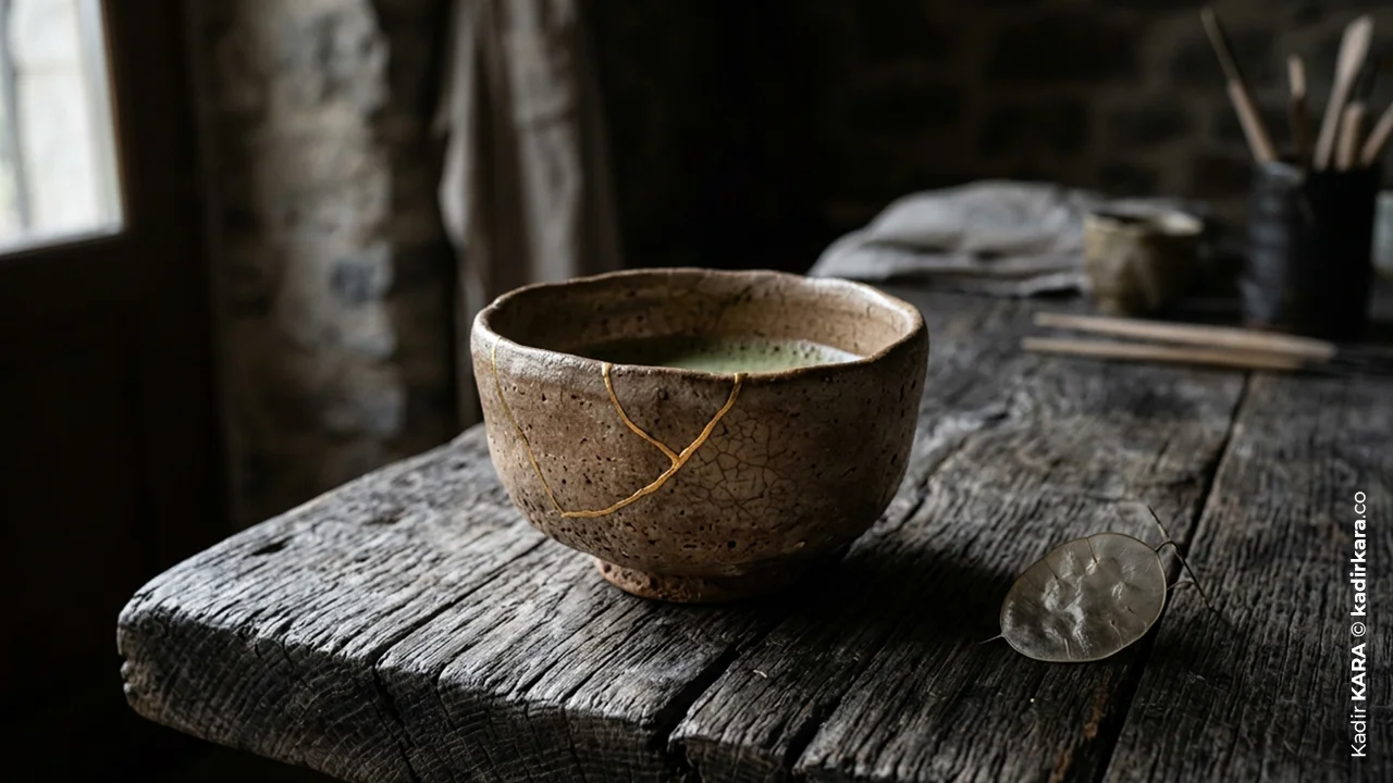
Wabi-Sabi: The Aesthetic That Stands Against Perfection
Wabi-sabi is a combination of two separate words: wabi and sabi.
Wabi originally carried a negative meaning… poverty, desolation, inadequacy. But over time this meaning transformed; particularly under the influence of Zen Buddhism, wabi began to express a kind of peace found in simplicity, in the ordinary, and in absence. A beauty that stands not in opposition to luxury, but outside of it.
Sabi, on the other hand, is about the traces left by time. The rust on an old object, the worn edge of a tea bowl, the wood turning grey… This change and decay, in the aesthetics of sabi, is not ugliness; it is a mark of depth and authenticity.
Together, wabi-sabi says: the goal of perfection is a wrongly constructed goal. What is incomplete, transient, and unfinished is beautiful. Moreover, this beauty arises precisely from that incompleteness.
Where Is This Reflected in Design?
Textures and Materials
Designs close to the wabi-sabi aesthetic reject smooth, shiny, and flawless surfaces. The uneven edge on a handmade ceramic, the natural crack on a table made from a maple log, the impression marks deliberately left in a print — these are not mistakes, they are character. In today's product photography we often see this as "imperfect staging" or "lived-in aesthetic"; but the source comes from wabi-sabi.
Typography and Print
Fonts close to handwriting, irregular alignments, deliberately "overflowing" print effects. These choices are the visual language of taking a position against the sterile perfection of digital design.
Color Palette
Wabi-sabi colors: earth tones, pale greys, muted greens, the tones of iron rust. Instead of bright and saturated colors, a palette that gives the impression of having faded with time. Linen, clay, ash… these are not merely trend colors; they are the reflection of an aesthetic stance.
Use of Space
In wabi-sabi designs, fullness is not an objective. Asymmetry is accepted. Not everything needs to have a mathematical relationship with everything else. A deliberate irregularity in placement, an element positioned not dead center on the page but shifted slightly to the left — this is the visual language of wabi-sabi.
Mono no Aware: The Beauty of Impermanence
Alongside ma and wabi-sabi, the third foundational pillar of Japanese aesthetics — mono no aware — can be defined as "the pathos of things" or "a deep awareness of impermanence."
Mono: means "things," "objects," or "existence."
Aware: Originally an exclamation expressing surprise or admiration during the Heian period (794–1185) ("Ah!", "Oh!"), it gradually came to describe a deep, heartfelt state of being moved in the face of something beautiful or sorrowful.
The reason Japanese cherry blossom festivals (Hanami) carry such profound meaning is not that the blossoms are beautiful — it is that this beauty lasts only a few days. Mono no aware does not separate beauty from impermanence; knowing that something will end is precisely what makes you feel it more deeply. Beauty and loss here are an inseparable whole.
In design, this concept means relinquishing the claim of permanence. Assuming that everything will hold eternal validity, that every campaign will be evergreen, that every design will transcend time — this is the exact opposite of mono no aware. Designing for this moment, for this context, embracing the instant; this is the practical counterpart of the concept.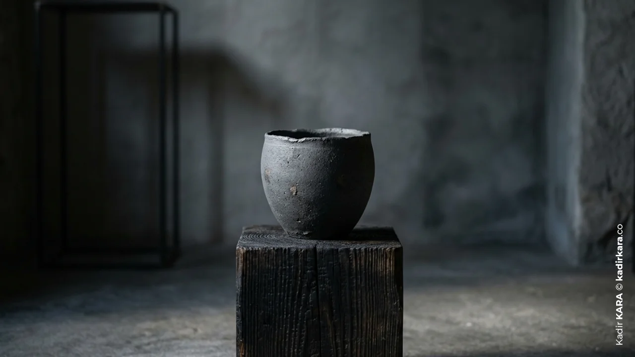
Shibui / Shibumi: Making an Impact Without Showing Off
Shibui (or in its noun form, shibumi) is a particularly advanced concept in Japanese aesthetics. Direct translation is not possible; but it might be described as "the deep impact that seeps through superior simplicity."
Shibui and its noun form Shibumi are among the most refined, most mature concepts in Japanese aesthetic philosophy. While mono no aware focuses on emotion and impermanence, Shibui expresses an unpretentious, effortless, and timeless sense of beauty displayed in design, art, and lifestyle.
Shibui is not a subset of simplicity; it is a mark of mastery. An object or design appears ordinary at first glance, but as you enter it, layers unfold. Simplicity has been used to conceal depth.
One of the designers who best illustrates this is Dieter Rams. Yes, not Japanese, but German. Yet Rams's principle of "less but better" overlaps surprisingly with the concept of shibumi. When you first look at his products, you might find them "ordinary" — but once you begin living with those products, day by day, use by use, you start to see the deliberate design decisions hidden within the simplicity.
Design Works Emerging from Japan: The Visual Evidence of This Philosophy
We need to read Japanese design aesthetics through concrete works.
Kenya Hara and Muji
Kenya Hara worked for years as the art director of MUJI and built the brand upon the concept of "emptiness." According to Hara, rather than having a specific personality, MUJI produces products that can "accept any personality." This approach is the application of the ma philosophy to brand identity.
Tadao Andō's Architecture
Concrete, light, and space. Andō's "Church of the Light" (Osaka, 1989) is a simple concrete church made of three walls with a cross-shaped cut in the rear wall. Viewed from inside, the natural light that changes throughout the day continuously transforms this cross shape. The design says so much with so few elements — because ma has been constructed correctly.
Masaki Hiroura and Irobe Studio
In the contemporary line of Japanese graphic design, a far more organic and handmade feeling dominates, in contrast to Western minimalism. The reason is that wabi-sabi is the aesthetic concern one wishes to preserve even through digital tools.
Carrying These Concepts into Western Design Practice
The greatest trap here is this: consuming these aesthetics and applying them without understanding them.
Using earth tones and cracked textures in the name of "wabi-sabi aesthetic" is not doing wabi-sabi. Spreading a rough-textured linen cloth over a product photograph and applying a faded filter is not wabi-sabi. It is wearing a wabi-sabi costume. The real difference begins not in visual choices but in intention — does the design genuinely relinquish the claim of reaching perfection, or does it merely imitate that relinquishment?
Starting with intention means this: when beginning a design project, asking yourself: "What should this design not include?" Most briefs are built around "show these things, communicate these things." Japanese aesthetic principles consider the question "what should be left out" at least as important as the first.
Reserving space, as a graphic design practice, means: even at the wireframe stage, deciding that certain areas will not be filled. Not as in "we can always put something there later if needed," but as in "this will remain empty and that is a decision."
Respecting the material is the practical essence of wabi-sabi. When choosing a texture or determining a color, bringing the character of that material forward rather than suppressing it. Allowing paper to look like paper, wood to look like wood…
Embracing asymmetry not as a tool but as an attitude is the design language of mono no aware. Not everything needs to be centered. Balance can be established not through symmetry but through the relationship between weight and space.
Yohaku no Bi: The Beauty of What Is Left
As the final concept in Japanese aesthetics, yohaku no bi — "the beauty of empty space" — ties the subject together.
Yohaku refers to the white areas left unpainted in a Japanese watercolor work. This act of leaving empty is not leaving the canvas unfinished; on the contrary, it is one way of finishing it. When the painter or designer decides to leave that area empty, they are in fact actively using that area.
In Turkish, "leaving a gap" most often means "incomplete." In Japanese aesthetics, yohaku no bi is the decision that "the most fitting answer for that area is emptiness."
The way to carry this into the next design project is to ask this question before the final: Which elements, if removed, would allow the design to speak more powerfully?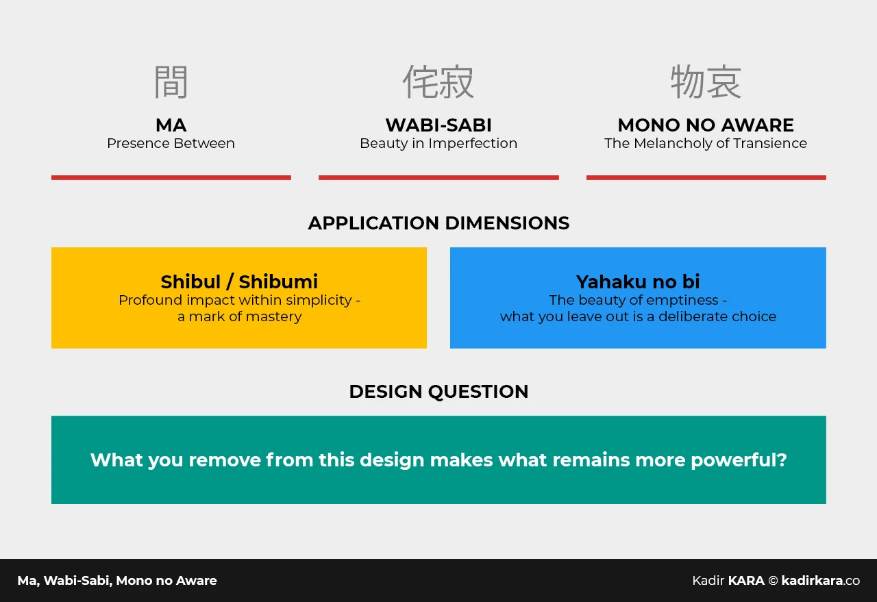
A BRIEF NOTE
There is a great deal written about Japanese aesthetics. Most of it either conveys the philosophy superficially, or establishes a false equivalence such as "minimalism = Japanese design." I structured this piece as an article explaining why ma needs to be read differently from negative space, and why wabi-sabi is not an "aesthetic trend." Because when these concepts are genuinely applied, they change design practice. Not only the visual output, but also the way decisions are made.
There is a quote I am very fond of from Antoine de Saint-Exupéry: "Perfection is achieved not when there is nothing more to add, but when there is nothing left to take away." Saint-Exupéry was not a designer — he was a French writer and pilot — but this sentence has, over the years, become one of the most quoted lines in the design world. Rightly so. Because it says exactly what ma, wabi-sabi, and yohaku no bi say: you reach the right design not by adding the excess, but by removing it.
For fifteen years, in design briefs, revision processes, and client presentations, I have asked the question "why is this element here?" every single time. Now I know more clearly: this question was answered in Japanese long before.
DID YOU KNOW? - 6 QUESTIONS 6 ANSWERS
1. Are "minimalism" and ma the same thing?
No. Minimalism is a Western aesthetic movement and is most often built upon reduction and simplification. Ma, on the other hand, treats emptiness as an active presence — it is a concept of in-between-ness, not of absence. In a minimalist design, space is "the area remaining after unnecessary elements are removed"; in ma, that area is something that was always meant to be there from the beginning.
2. Is it possible to "apply" wabi-sabi to a design, or is this an attitude?
Both — but the order matters. Wabi-sabi is first an attitude, then an application. Simply using earth tones and broken textures does not constitute wabi-sabi; it references wabi-sabi. Real application begins with the design genuinely relinquishing its claim to reaching perfection.
3. How is the concept of ma read in typography?
In Japanese typography, letter spacing (Tracking) and line spacing (Leading) aim not for visual balance but for the words to "breathe." The typographic counterpart of ma is the conscious interval between letters and words. This interval is a philosophical decision that precedes readability.
4. What is the connection between Kintsugi and wabi-sabi?
Kintsugi is the art of repairing broken ceramic pieces with gold. This practice is the embodied form of wabi-sabi: the mark of breakage and repair is part of the beauty, not a flaw to be concealed. In design, the counterpart of this can be read as "bringing the flaw forward rather than correcting it."
5. Why is mono no aware rarely taught in design education?
Because impermanence and melancholy do not fit the core discourse of design education — "produce solutions, show results, measure impact." Mono no aware means accepting the lifespan and momentary value of a design; and that is an idea a performance-driven industry cannot comfortably sit with.
6. Is "yohaku no bi" exclusive to the visual arts?
No. Yohaku no bi also exists as silence in music, the unspoken in literature, and the responses left unfilled in conversation. In Japanese communication culture, "speaking with ma" — that is, being able to wait without rushing to fill silence — is regarded as a social skill. In design, it is a reminder that one is not obligated to fulfill every request in a brief.

Japanese Design Philosophy: Ma, Wabi-Sabi, Mono no Aware

DISCOVER MORE
