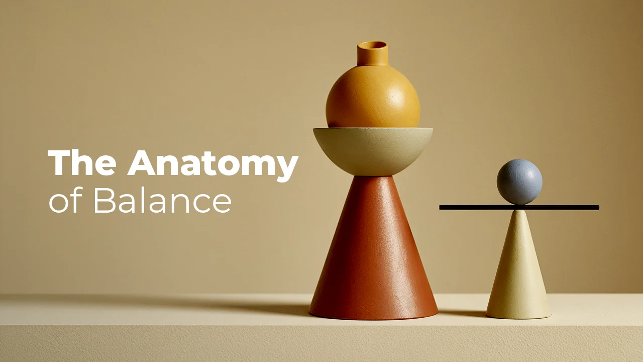
Have you ever wondered why a poster "sits right," why a logo inspires trust, why a web page draws your eye to a specific point? The answer is often not in the color or the typeface, but in an invisible scale: Balance. In graphic design, symmetrical balance gives you order and authority, while asymmetrical balance adds movement and curiosity to the same surface. A designer who truly understands these two concepts no longer imitates templates; they make their own compositional decisions consciously. In this article, we'll examine one by one how both work, how they are built, and where mistakes are most often made in the field.
What Is Balance? The Thing Your Eye Looks for Without You Realizing It
In graphic design, balance is about how the visual weight in a composition is distributed. Not physical weight. An element's "weight" arises from its size, color, texture, position, and shape. When the eye looks at a surface, it unconsciously weighs these weights; if the result is balanced, it feels at ease, and if it's unbalanced, it feels uneasy.
This is not a coincidence. Gestalt psychology, founded in Germany in the early 20th century by Max Wertheimer, Wolfgang Köhler, and Kurt Koffka, showed that the human mind perceives visual elements not individually but as a whole. Symmetry is one of the fundamental perceptual laws defined by Gestalt: the brain automatically reads elements that resemble or mirror each other as a single group. This sometimes makes our job easier, and sometimes gives us the opportunity to deliberately make it harder.
Balance is established in two basic forms: symmetrical and asymmetrical. There is also radial balance, but its boundaries are debated even among designers. This article's focus is primarily on symmetrical and asymmetrical balance. Neither is "right" nor "wrong"; both are tools. Which one you choose depends on what the design wants to say.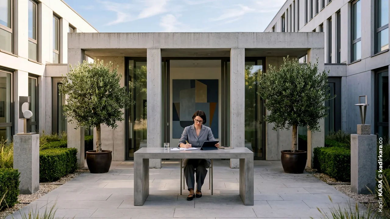
What Is Symmetrical Balance?
Symmetrical balance is the distribution of equal visual weight on both sides of a composition's central axis (vertical, horizontal, or diagonal). Its purest form is "reflection symmetry." One side of the axis is nearly an exact mirror of the other. It is frequently seen in formal invitations, book covers, and luxury brand advertisements because it conveys a sense of authority and seriousness.
But symmetry is not a single pattern; it appears in four different forms:
Reflection Symmetry
Creates a mirror image along a vertical or horizontal axis; it is the most common and most "classic" type.
Radial Symmetry
This is when elements radiate outward from the center at equal intervals; it works well in mandalas, in some logo families, and in compositions where you want to create a sense of rotation.
Translational Symmetry
It does not involve mirroring; an element establishes balance by repeating at regular intervals. It is frequently used in packaging patterns and corporate identity textures.
Glide Symmetry
It is a combination of reflection and translation. An element is both reflected and shifted. Think of footprints; the right foot is a reflection of the left, but one step ahead. It creates a surprisingly modern feel in typographic compositions.
The psychological effect of symmetry is clear: order, stability, trust. But this comes at a cost. If a composition is perfectly symmetrical for too long, the eye "solves" it quickly and loses interest. This is symmetry sliding into monotony. That's why experienced designers rarely work with "pure" symmetry; they almost always leave a small margin of disruption. I'll touch on this shortly.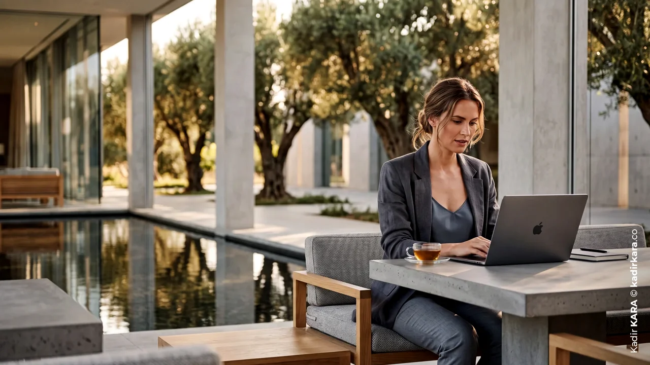
What Is Asymmetrical Balance?
Asymmetrical balance is when the elements on either side of the axis are not identical to each other, but still create an equivalent visual weight. The key word is "equivalent," not "equal." On one side there might be a large, dominant image; on the other, a few small text blocks or a plain negative space. The two are not physically alike at all, but the scale still remains balanced.
This did not emerge by chance in design history. In 1928, German typographer Jan Tschichold openly opposed centered, symmetrical page layouts in his book Die Neue Typographie. Drawing on the Bauhaus and Russian Constructivism, he advocated for an asymmetrical, sans-serif, functional approach to typography. According to him, asymmetry was a visual expression of the movement of modern life itself. Tschichold stepped back from this rigid stance in the 1940s and devoted the second half of his career to classical, symmetrical book design. So even asymmetry's fiercest advocate eventually arrived at the point of "both are necessary."
There are also plenty of examples in the plastic arts. Picasso's Guernica (1937) portrays the chaos created by war not through symmetry, but through a deliberately unbalanced distribution of figures. Piet Mondrian's compositions rest on a similar logic: squares and rectangles are placed with mathematical precision, but they never form mirror symmetry. In art history literature, this approach is defined as an internally consistent balance established between surfaces of different color and scale.
This is precisely where the power of asymmetrical balance comes from. The eye encounters a puzzle that needs to be solved. While the brain tries to solve this puzzle, the viewer stays on your design longer.
| CRITERION | SYMMETRIC BALANCE | ASYMMETRIC BALANCE |
|---|---|---|
| Definition | Distributing equal visual weight on both sides of the axis |
Establishing equivalent visual weight through unequal elements |
| Reference Point | A fixed, single central axis | A shifting visual center of gravity |
| Dominant Perception | Order, authority, trust, formality | Movement, energy, curiosity, dynamism |
| Eye Behavior | Quickly "resolves" the composition | Wanders through the composition for longer |
| Main Risk | Monotony, stagnation | Clutter, a sense of imbalance |
| Application Difficulty | Relatively low – the rules are clear | Relatively high - requires experience and practice |
| Grid Relationship | Centered, single-axis grid | Modular, multi-column grid |
| Areas of Strength | Corporate identity, formal invitations, forms/login screens |
Editorial design, posters, web interfaces, storytelling |
| Symmetric and Asymmetric Balance: Key Differences Comparison Table | Kadir KARA © kadirkara.co | |
6 Factors That Determine Visual Weight
In order to establish asymmetrical balance consciously rather than by eyeballing it, you need to know the variables that make up "visual weight." These are not a mathematical formula, but in practice they are quite predictable rules:
Size and Scale
The simplest rule: Large elements are heavier than small ones. If you've placed a huge image in one corner of the page, you need to fill the opposite side with several small elements.
Color and Tonal Value
Dark colors are perceived as heavier than light colors. Warm colors (red, orange) stand out more than cool colors (blue, green). A small but bright red button can balance a large but pale background.
Texture and Pattern
A complex, textured surface holds the eye longer, and therefore feels heavier. Flat, smooth areas let the eye glide over quickly.
Position and Isolation
An element placed farther from the center creates a greater leverage effect, following seesaw logic. An element standing alone in empty space attracts as much attention as a crowded group; isolation itself is a visual weight.
Shape and Form
Irregular, complex shapes attract more interest than simple geometric forms (square, circle), and are therefore heavier.
Direction and Movement
Vertical forms are perceived as heavier than horizontal forms; diagonal lines, meanwhile, add extra energy to the composition.
Knowing these six variables turns asymmetrical balance from a matter of luck into a craft. What we need to pay attention to here is that these rules work together, in layers. In an actual piece of work, an element can be large, dark, and close to the center all at once, in which case you need to account for its weight threefold.
How to Create Symmetrical Balance? Practical Techniques
As a rule, establishing symmetrical balance is easier than asymmetrical, because you have a mathematical skeleton in hand. Still, paying attention to a few points makes your job easier:
Determine the axis first, place the elements after.
Imagine a vertical or horizontal line running straight through the middle of the page; position every element relative to this line. The alignment and smart guide features of tools like Photoshop, Illustrator, and Figma largely automate this.
Match color and tone.
If you don't use the same color intensity on both sides, the eye will sense imbalance even if the shapes are symmetrical. Symmetry is not just equality of position but also equality of tone.
Equalize the sizes exactly.
The dimensions of the images on the left and right must be identical down to the millimeter; "approximately the same" doesn't work in symmetry, the eye catches the difference immediately.
Deliberately avoid perfection.
Pure symmetry quickly becomes boring. Experienced designers often use the "broken symmetry" technique: they set up the overall composition symmetrically and leave a small asymmetry in a single detail (a color difference, one shifted element). Think of it like one eyebrow being slightly raised on a symmetrical face. It doesn't disrupt the overall order but keeps interest alive.
This last point is actually where pure symmetry and asymmetry intersect; separating the two with sharp boundaries is often the wrong approach.
How to Create Asymmetrical Balance?
Practical Techniques Asymmetrical balance is not "random distribution"; on the contrary, it needs an invisible grid that is even stronger than symmetry's. Here are the techniques that genuinely work in the field:
Build a modular grid.
Divide the page into unequal columns; for example, spread the image across 4 columns while compressing the text into 2 columns. This arrangement, which appears asymmetrical on the surface, does not turn into chaos thanks to the invisible grid underneath.
Apply the rule of thirds.
This technique from photography carries over directly to graphic design: divide the surface into thirds both horizontally and vertically, and place the main element not at the center but at one of the intersection points. Leave the opposite side empty or fill it with a much lighter element.
Use negative space as an active element.
Empty space is not "unused area," it is itself a balancing element. Placing an unfilled, breathing space opposite a dense image is, by itself, a balancing technique.
Establish visual hierarchy.
There must be a clear order of size and importance among the elements; the largest element should carry the most important message, and the rest should serve it. Asymmetry without hierarchy is just clutter.
Add directional lines.
A diagonal line, a tilted form, or a gaze direction carries the eye to the point you want in the design. In asymmetrical compositions, the eye doesn't wander on its own; you must guide it.
All of these techniques come down to a single principle: Asymmetry is not a lack of discipline, it is a hidden discipline. Beneath a good asymmetrical design, there is a structure that goes unnoticed but is always present.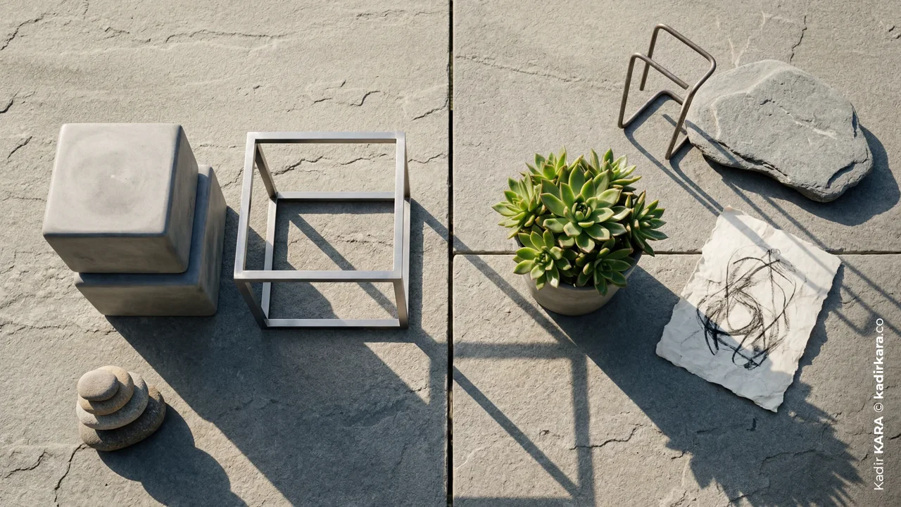
Which Project Wants Which Balance?
Let's set theory aside and turn to the language of the field: Which balance should you choose for which job?
Corporate Identity and Logo Design
This mostly leans on symmetry or near-symmetrical structures, because the brand wants to convey a "trustworthy and established" message. But this, too, is not a rule on its own. If the brand's character is "creative and rebellious," a deliberate asymmetry can be preferred even in the corporate identity itself.
Formal Invitations, Certificates, Forms, and Login Screens
On surfaces where the user must not be confused, symmetry is still the safest harbor. The user understands what to do without having to think about it.
Editorial Design
Magazines, catalogs, blog cover images... This is the field that draws the most from asymmetry. Leaning the title toward the edge or the bottom of the page instead of the exact center keeps the reader's interest longer.
Poster and Placard Design
Advertising posters love asymmetry, because the goal is usually to draw attention to a single point; symmetry softens this emphasis, asymmetry sharpens it.
Web and Interface Design
Symmetrical and asymmetrical form an inseparable whole, the two live side by side: while "split screen" layouts are built on a symmetrical skeleton, content blocks are often placed asymmetrically. The only warning here is that an asymmetrical structure that looks great on desktop can lose its meaning on mobile, in a vertical flow; you need to plan this transition separately in responsive design. Because what you lose when you skip this planning is not just aesthetics, but the effect that balance is supposed to deliver: if you can't rebuild the asymmetrical hierarchy you set up on desktop in a way that gives the same feeling on mobile, you can't truly benefit from symmetrical or asymmetrical balance on that screen. That weight distribution that draws the eye to the right point in the first second on desktop may not be able to provide the same focus once it loses its order or strength in a vertical flow; the design still looks like it "works," but it no longer emphasizes anything.
Common Mistakes and Tips
Finally, let's turn to the mistakes most frequently encountered in the field and the practical ways to prevent them:
The "Approximate Symmetry" Trap
Aligning elements by eye in a symmetrical design is the biggest mistake. The eye doesn't consciously notice millimetric differences, but it feels the discomfort. Be sure to use alignment tools.
Confusing Asymmetry with Clutter
The difference between asymmetrical balance and a chaotic layout is the invisible grid underneath. Distributing elements randomly is not asymmetry; every "different" arrangement made without a conscious weight calculation is simply disorder.
Skipping the Grayscale Test
The fastest way to tell whether a design is balanced is to convert it to grayscale and look at it with squinted eyes. When color and detail are taken out of the picture, only raw visual weight remains; imbalance instantly becomes visible.
Leaving Mobile Compatibility for Last
An asymmetrical layout that looks flawless on desktop usually loses its meaning on a narrow mobile screen; once elements stack on top of each other, the "shifted weight" logic collapses. The right approach is not to handle mobile as a separate stage, dealt with once at the very beginning; it's to ask, at every step while building the desktop interface, "how will this translate on mobile?" and shape the asymmetrical hierarchy according to that question. The way to truly not leave mobile for last is not to design it early, but to keep asking throughout the process.
Using the Same Balance in Every Project
A designer's signature is not working "always symmetrical" or "always asymmetrical." It is being able to correctly read which project deserves which balance. Being able to make this distinction is the craft itself.
A SHORT NOTE
The reason I chose this topic is simple: the most common creative blind spot I've seen over the years is never asking the question "why did I center this?" As a young designer, I too used to align everything to the center; it was a safe harbor, after all. Over time I realized this wasn't a choice, it was a reflex. It served my own comfort, not what the brief was asking for.
Today, one of the first questions I ask myself when starting a job is this: does this brand, this page, this image... want to "stand still" or does it want to "move"? If the answer isn't clear, there's usually a lack of clarity in the question itself; that's when I go back to the brief.
There's also something I can't pass over without saying: choosing asymmetry "to look modern" is just as lazy as choosing symmetry "because it's easy." Both are tools, neither is the goal. Mastery is knowing which tool says which sentence better; not forgetting the sentence and just falling in love with the tool.
While writing this article, what I remembered most is just how concrete and teachable the concept of "visual weight" actually is. Balance is not a matter of talent, it's a matter of observation.
DID YOU KNOW? 12 QUESTIONS 12 ANSWERS
1. Why does symmetry sometimes feel "boring" and sometimes "trustworthy"?
Both come from the same root: predictability. The brain solves a symmetrical composition quickly, and this speed creates a feeling of trust. But that same speed also exhausts interest when looked at for a long time; trust and boredom are actually two sides of the same coin.
2. Is radial balance considered symmetrical or asymmetrical?
In fact, there isn't even a clear consensus in design literature. Some sources divide balance into three (symmetrical, asymmetrical, radial) and treat radial as an independent category. Other sources classify radial symmetry as one of the subtypes of symmetry, alongside reflection and translation. Neither is wrong, it's just a difference of perspective. What matters in practice is knowing that the elements radiate from the center at equal intervals and create a sense of rotation.
3. What exactly is the difference between "visual weight" and physical size?
Physical size is measured with a ruler, visual weight with the eye. A small but bright red element can feel much "heavier" than a large but pale gray area. What you balance as a designer is perception, not centimeters.
4. Why does a dark color look "heavier" than a light color?
Although the exact reason is debated, the result in practice is clear: because dark tones reflect less light, the eye perceives them as more intense, and therefore more dominant. A small black element attracts more attention than a gray element of the same size.
5. Can asymmetrical balance be established without a grid system?
Theoretically yes, in practice almost never. The vast majority of "asymmetrical" attempts made without a grid turn into clutter after a few revisions. The invisible grid is the hidden skeleton that provides asymmetry's discipline.
6. When a client says "make it look more corporate" in a brief, what is the first thing that changes in terms of balance?
The first thing I usually reach for is fixing the axis. The "corporate" feeling often comes, before the color palette, from a symmetrical structure sitting on a central axis; even if the client describes this as "simplify it," what they actually want is balance.
7. What is the most common trap an inexperienced designer falls into with asymmetry?
Trying to balance weight using size alone. Whereas color, texture, and position are equally powerful tools. An asymmetry attempt that focuses only on size usually can't get past the look of "one side big, one side small."
8. In a symmetrical composition, is a perfect mirror image always the best result?
No, and this is a nuance most new designers miss. Perfect symmetry is ideal in some contexts (form pages, official documents), but it can come across as rigid and distant in work where the brand personality needs to be "warm" or "human."
9. Is asymmetrical balance in nature really more common than symmetrical?
Don't be fooled by appearances: although the outer contours of living things mostly look symmetrical (face, wing, leaf), the placement of internal organs, branch growth, and many shell patterns are largely asymmetrical. Nature operates in a far more asymmetrical way than it appears at first glance.
10. In photography, are the rule of thirds and the golden ratio spiral the same thing?
No, they're related but not the same. The rule of thirds is simply a grid that divides the surface into nine equal squares; the golden ratio spiral, on the other hand, is a curve based on the Fibonacci sequence that narrows toward the center. Both draw the eye to a specific point, but their mathematics differ.
11. Where does the "fear of centering everything" seen in young designers come from?
Largely from trend pressure. In recent years, asymmetry has become almost synonymous with looking "bold" and "editorial"; this leads some designers to avoid centering even when the job genuinely calls for symmetry. Trend should not take the place of the brief.
12. Do AI image generation models show a natural tendency toward symmetry?
In practice, yes, there is a noticeable tendency: most image generation models, especially for subjects like faces and portraits, tend to produce centered, near-symmetrical compositions by default. If you want deliberate asymmetry, you need to specify this separately and clearly in the prompt.
SOURCES
Adobe: Basic Graphic Design Principles and the Concept of Balance
Smashing Magazine: Compositional Balance, Symmetry and Asymmetry Principles
Wikipedia: The Foundations of Gestalt Psychology and Laws of Perception
Britannica: Jan Tschichold and the Historical Origins of Asymmetrical Typography
Traces of Symmetrical and Asymmetrical Balance in the Plastic Arts


