
When you remove color from a photograph, what emerges isn't a missing image, it's a rearranged map of attention. Black and white photography brings forward the tone, texture, and form that the eye so often hides behind color. What's more, the human retina contains roughly twenty times more rod cells, which are sensitive only to differences in tone, than cone cells, which perceive color. In other words, your brain is actually wired to see tone far more than it's wired to see color. In this piece, we'll look at both why colorlessness is such a powerful tool for producing meaning, and the concrete ways to learn to speak this language, from red filters to the zone system.
What Is Black and White Photography? What Does Colorlessness Mean?
Photography is already an act of abstraction. You take a single frame, a single moment, out of the world's endless flow, and leave everything else outside the frame. Black and white photography adds a second layer to this abstraction: it removes color as well. What remains isn't a deficiency, it's concentrated information. Tone, texture, form, line, and light itself.
There's an interesting biological fact that shows this isn't a random preference. The human retina contains roughly 120 million rod cells compared to only 6 to 7 million cone cells, a ratio of roughly 20 to 1. Rod cells don't perceive color, only light intensity and tone; cone cells process color but occupy a far smaller share of the visual system. In other words, your visual system already processes tonal information with a much larger army of cells than it uses for color. Black and white photography, then, doesn't run against the mainstream of your visual biology, it speaks directly to its very center.
In practice, this means that when you remove color, the viewer's attention automatically shifts to the other compositional elements: the relationship between light and shadow, the texture of surfaces, the form of objects. A bright red jacket or a vivid sign that catches your eye in a color scene gets reduced to a shade of gray once the same frame is converted to black and white, and it can no longer monopolize your attention. Here, colorlessness isn't a loss, it's a redistribution.
There's even a moment when this approach turned into a manifesto in the history of photography. Formed in the early 1930s when names like Ansel Adams, Edward Weston, and Imogen Cunningham came together, the f/64 Group pushed back against the softly focused, painting-imitating "pictorialist" movement fashionable at the time, and embraced a "pure photography" philosophy that championed sharp focus, full tonal range, and flawless clarity of texture. This group's legacy is still felt today. The way black and white brings tone and texture so strongly to the forefront isn't a coincidence, it's the continuation of a deliberate aesthetic stance.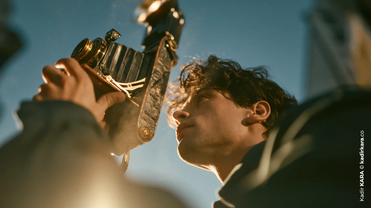
Why Shoot Black and White Photography? Historical and Psychological Roots
In the early days of photography, black and white wasn't a choice, it was a necessity; the materials of the era weren't suited to producing color images. Over time, technology evolved into highly sensitive panchromatic black and white film that converted all the colors in the visible light spectrum into accurate shades of gray. Color film technology actually existed much earlier than expected, but for a long time it couldn't become the dominant choice among photographers. There were two reasons for this: black and white film was cheaper and easier to produce, and monochrome also had its own aesthetic intensity that was difficult to imitate. For many years, the art world also almost directly equated "serious" photography with black and white. I'll explain shortly, with a historical anecdote, how this perception was broken.
There's also a concrete reason why the documentary photography and photojournalism tradition became so identified with black and white. For many years, newspaper and magazine printing technology either didn't support color printing at all or made it very costly. For most of the century, the default language of news photography was black and white, and this became nearly synonymous with "real," "serious," and "impartial" in the viewer's mind. Even though this technical necessity has disappeared today, that perceptual legacy is still alive; when we see a documentary photograph in black and white, we tend to automatically attribute more weight and credibility to it.
There are also psychological reasons why this preference still continues today:
Silencing Color Noise
Especially in genres like street photography, where the photographer doesn't have control, random colors that enter the frame (a bright yellow bus, a multicolored sign) can overshadow the composition's real message; colorlessness erases this noise.
Not Getting Caught by Time
A color photograph is often shot with a palette specific to its era (the tone of a particular film stock, the fashionable colors of a particular decade), and this inevitably dates the image. In black and white, this historical clue largely disappears.
The Legacy of the Family Album
The oldest photographs in most of our family albums are black and white, because they date from a time before color had become widespread. This is why our minds unconsciously associate black and white with the concepts of "the past," "memory," and "permanence." When a photographer today deliberately shoots in black and white, they're actually also activating this ready-made network of associations in the viewer's mind.
But it must also be clearly stated that this isn't a universal rule. In a photography project depicting Cuba, India, or similarly color-rich cultures, black and white generally loses its function, because color itself is already an important part of the story that culture tells. The same is true for many sunsets or golden hour landscapes. Black and white is powerful in documentary narratives, in portraits where emotion takes center stage, and in compositions weighted toward graphic elements and texture.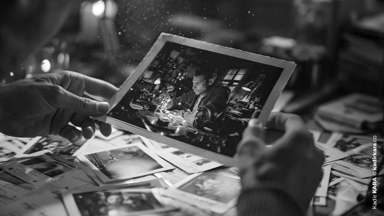
The Fundamental Differences Between Color Photography and Black and White Photography
The difference between these two formats isn't only visual, it's also technical and perceptual. In color photography, what first catches your eye is often color harmony or color contrast; in black and white, this role is taken on by tone, texture, and form. This directly changes your technical priorities at the moment of shooting, especially when it comes to managing contrast.
| CATEGORY | COLOR PHOTOGRAPHY | BLACK AND WHITE PHOTOGRAPHY |
| Primary Visual Emphasis | Color harmony, vibrancy, color contrast | Tone, texture, shape, line |
| Attention Management | Colors draw the viewer's eye; can scatter attention in uncontrolled scenes |
Attention is directed straight to light, form, and subject |
| Required Contrast Level | Moderate contrast is usually sufficient | Higher contrast is generally required; otherwise the image looks "flat" |
| Ideal Lighting Condition | Soft, golden hour light is often preferred | Harsh, high-contrast midday light can also produce strong results |
| Temporality | Period-specific color palettes can date the image |
Largely timeless, offers no era-specific clues |
| Post-Production Approach | White balance, color saturation, and color harmony management |
Channel-based tone mapping, contrast curves, filter simulation |
| Best-Suited Genre Examples | Vibrant cultural scenes, sky/sunset-dominant landscapes |
Documentary, portrait, architecture, street, texture-focused still life |
| Comparison table showing the differences between color photography and black and white photography. |
Kadir KARA © kadirkara.co | |
The most critical row in this table is contrast. Because there's no such thing as color separation in black and white, if two different colors happen to share the same brightness value (say, a vivid red next to an adjacent green), both can fall into the same shade of gray and the composition can blend together. This is why, when shooting in black and white, the question of "which colors are present" should be replaced by the question of "which tones stand apart from each other."
This difference also carries over into exposure metering. In color shooting, you can largely rely on the camera's matrix metering; in black and white, it's far more reliable to control the scene's most critical tone (usually a face or the main subject) with spot metering. Because the only factor deciding which gray value that tone will fall into is light, and there's no color contrast behind it to "save" it.
Tips and Tricks for Shooting Black and White Photography
Reading Contrast: The Lifeblood of Black and White
Contrast is the backbone of black and white photography. Interestingly, this makes the harsh midday light usually avoided in color photography valuable in black and white: the deep shadows and bright highlights that form when the sun is high and harsh create a clear separation between gray tones and add power to the image. When the same scene is shot in soft, flat light, it usually looks two-dimensional and flat in black and white.
One of the mental frameworks here is the logic of the "zone system." All the tones in the scene, from the darkest shadow to the brightest highlight, are divided into eleven steps, and the photographer mentally works out in advance which element will fall into which tone before pressing the shutter. The histogram in digital cameras is, in fact, a modern extension of this same logic.
There's an old but effective habit that works even without a camera: looking at the scene with your eyes squinted. When you squint, fine color distinctions blur, leaving only coarse tonal blocks, meaning you roughly see the scene "in black and white eyes." If the subject still stands out clearly from the background even in that state, the frame will probably turn into a good black and white image.
Controlling Tone with Color Filters
A technique left over from the film era, but still living on today embedded inside the "monochrome" settings of most digital cameras: color filters. The logic is simple but effective. A color filter lets through light at its own wavelength while largely absorbing the wavelengths of opposing colors. As a result, tones belonging to that color come out lighter than expected in the black and white image, while opposing tones come out darker. Colors that sit opposite each other on the color wheel (such as red-green, blue-orange) work in exactly opposite directions under this logic. Choosing a filter's color is, in effect, deciding which color in the scene you'll lighten and which you'll suppress.
| CATEGORY | EFFECT | MOST SUITABLE USE CASE |
| RED | Significantly cuts blue wavelengths; noticeably darkens the sky, increases cloud-sky contrast |
Dramatic skies, pre-storm atmosphere, high-contrast landscapes |
| ORANGE | Provides general-purpose contrast enhancement; moderately darkens the sky, reduces atmospheric haze | General landscape and architectural shots |
| YELLOW | Increases contrast between foliage and sky in a balanced way, preserves a natural look |
General use, scenes calling for a slight contrast boost |
| GREEN | Brightens the green tones in the image; brings out leaf and plant texture |
Vegetation, still life, botanical shots |
| BLUE | Darkens warm colors; works in the opposite direction to other filters |
Foggy/hazy scenes, cold and melancholic mood |
| Comparison table showing the differences between color photography and black and white photography. | Kadir KARA © kadirkara.co | |
On digital cameras, you don't need to attach these filters as physical glass; you can select their digital simulations from the Picture Style or Monochrome menu. My only recommendation: shoot RAW+JPEG even while applying a filter. While JPEG gives you an instant monochrome preview, the RAW file preserves all the color information, so if you change your mind later, you retain full flexibility.
Building Composition with Texture, Form, and Line
Once color drops out of the equation, the composition's center of gravity shifts directly to texture, form, and line. A cracked wall, the grain of wood, the texture of fabric, the geometry of an architectural facade... All of these, which might remain in the background in a color photograph, turn into primary compositional elements in black and white.
This principle takes different shape depending on the genre. In portraiture, the smallest change in the eyes and facial expression (a raised eyebrow, a twitch at the corner of the mouth) becomes far more noticeable thanks to colorlessness. In landscape, you can't rely on the color of golden hour; instead, you need to look for "permanent" compositional elements like leading lines, the form of bare trees, or rock texture. In street photography, the boundary line where light meets shadow becomes the true grammar of the composition.
Still life photography perhaps shows the purest form of this principle. Because here, it's you, not color, who constructs the scene. Edward Weston's famous 1930 work "Pepper No. 30," which transforms a single pepper into an almost sculptural form, is one of the classic examples of this. Once color is completely taken out of play, what remains is the object's bare geometry and the play of light on its surface. You can use the same logic in your own still life attempts. Introduce the object not through its color, but through its curves and its relationship with light.
In-Camera or in Post-Production?
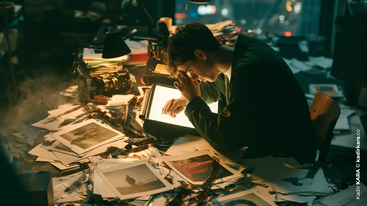
There are two paths: shooting with the camera's monochrome mode to get an instant preview, or shooting in color and converting afterward. Both are valid, but the healthiest approach is to combine the two. When you set your camera to shoot JPEG+RAW and select the Monochrome Picture Style, you see black and white directly on the LCD screen or in the viewfinder. This is also the fastest way to learn to "see in black and white," because you see exactly which color will turn into which tone before you press the shutter. Since the RAW file recorded at the same time preserves all the color information, you can switch back to color with a single click if you regret your decision.
On the post-production side, while the Channel Mixer tools in general-purpose editing software are sufficient, dedicated plugins focused specifically on black and white conversion, like Silver Efex Pro, offer color filter simulations and regional tone adjustments through a much more visual and faster interface. The essence of the work stays the same: you decide which color falls into which shade of gray, the software just makes the way you implement that decision easier.
Common Mistakes
The first is seeing black and white as a tool for "saving" a weak photograph. Removing the color from a frame with composition or lighting problems doesn't hide the problem, it just brings it out in a different form.
The second is shooting indoors without an additional light source; in this case, the image already comes out lacking detail and dark, and adding black and white on top of that makes the result even worse.
The third is forcibly stripping the color from a scene whose meaning is largely hidden in that color. Some landscapes and cultural narratives don't allow for this. Finally, converting a frame shot in flat light to black and white without adding contrast; this usually produces a flat, two-dimensional result.
A fourth and often overlooked mistake is this: framing the shot without trying to distinguish between objects whose tones are very close to each other (for example, two different colors that fall into the same light gray). The result is an image that's hard to read, where the subject visually "merges" with the background.
In the end, black and white isn't a technical filter, it's a separate discipline of seeing. It was certain names in the history of photography who first grasped this, and who first systematized it.
"When you photograph people in color, you photograph their clothes.
But when you photograph people in black and white,
you photograph their souls!"
Ted Grant
A SHORT NOTE
As someone who has worked in brand identity and visual production for eighteen years, I don't see black and white as a tool for nostalgia; I use it as a "stress test." The fastest way to understand whether a composition, a frame, or a brand visual is truly solid is to pull the color out of it. Color always grants a bit of forgiveness. Even a bad composition can be rescued by a beautiful sunset. Black and white removes that forgiveness and leaves behind only the question of whether the fundamentals are right or wrong.
This is exactly why I chose this topic: the question "how does colorlessness produce meaning" has always struck me as a slightly backward question, because what's actually happening isn't a loss, it's a reprioritization. That was also what I focused on most while writing. To describe the absence of color not as a deficiency, but as an editorial choice that decides where attention will go.
DID YOU KNOW? 14 QUESTIONS 14 ANSWERS
1. What exactly does "contrast" mean in black and white photography?
Contrast is the magnitude of the difference between the darkest and lightest tones within a frame. In color, this difference is also supported by color contrast, but in black and white, the entire load falls on tonal difference; this is why contrast is far more decisive here.
2. Why do some scenes look "flat" in black and white?
Under homogeneous, soft light (an overcast sky, a shaded area), the tones in a scene stay very close to each other. Since color isn't in play, this closeness can't be hidden, and the image feels two-dimensional and flat.
3. What is the zone system, does it still work today?
It's dividing all the tones in a scene into eleven steps, from darkest to lightest, and planning your exposure in advance based on that. Although it was developed for film, the logic of reading a digital histogram still rests on this same principle.
4. Why does a red filter darken the sky so much?
A red filter absorbs most of the blue wavelengths. Since the sky naturally reflects blue light intensely, once that light is filtered out, the sky darkens noticeably in black and white.
5. Why is it recommended to shoot RAW + JPEG together?
JPEG instantly applies the camera's built-in monochrome setting and gives you a preview. RAW, on the other hand, preserves all the color information; it gives you flexibility if you change your mind about black and white, or if you want to try a different tone mapping in post-production.
6. Can every photograph be converted to black and white?
Technically, yes, but not meaningfully. In scenes where color is an inseparable part of the story (vivid cultural textures, sunset landscapes), black and white mostly weakens the image.
7. What should you pay the most attention to in black and white portraits?
The eyes and facial expression. When there's no color, the viewer's attention turns directly to these two elements; even the smallest change in expression determines the photograph's impact.
8. What is the biggest challenge in black and white street photography?
That most of the composition is built instantaneously, outside the photographer's control. You have to read where light and shadow intersect in the moment and frame the shot accordingly.
9. Why do photographs of some cultures feel "incomplete" in black and white?
Because color itself is an important part of that culture's visual identity. When you remove the color, a piece of the narrative itself goes missing.
10. What's the difference between the black and white preview on the camera screen and the RAW file itself?
The preview on screen is an interpretation produced by the camera's JPEG processing engine. The RAW file, on the other hand, still carries the full-color sensor data; in other words, the "black and white" you see is actually a suggestion that hasn't been recorded yet, not the file itself.
11. Why does a black and white print feel so different from a digital screen?
Tone transitions on paper offer a physical experience very different from a screen's backlighting; a print also naturally limits the brightness range the eye can perceive at once, which lets you read the composition more "calmly."
12. How do you tell, at the moment of shooting, whether a photograph will convert well to black and white?
When looking at the scene, don't look for colors, look for areas of similar brightness. If the composition's strength comes entirely from color contrast and the tones are very close to each other, that frame will probably come out weak in black and white.
13. Why do some brands and ad campaigns deliberately choose black and white?
Because colorlessness carries a claim about the product or the message itself: timelessness, simplicity, luxury, or seriousness. Once color drops out, the brand can focus directly on form and emotion without distraction.
14. Why is negative space an especially powerful tool in black and white photography?
Empty space is effective even in color, but it becomes even more pronounced in black and white. Because there's no color allure to pull the eye away from the subject. Deliberately left empty space frames the main subject more powerfully.


